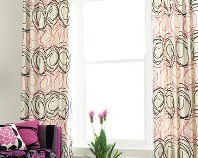
Decorate with the Color of the Year
 January 18, 2011
  Sarah Van Arsdale - If one of the purposes of good design is to lift the mood, then the designer's job has become much more challenging in the past couple of years, with the bad economy dragging everyone's spirits down. Those of us in the design field know that a beautiful, well-lit room, furnished with harmonious pieces, awash with carefully-chosen color, will help cheer the heart and lift the soul.
So, when things are looking grim, we just need the right color to perk us up… Okay, it isn't really that simple, but we all know that color really does influence mood. And Pantone, the color authority, has announced its color for 2011, and it's one that's sure to lift everyone's spirits, if not their bank account balances: honeysuckle.
 Pantone describes honeysuckles as "a dynamic reddish pink." It's got a tone deeper than pink, but brighter and paler than red. And yet, it isn't too sugary-sweet; honeysuckle is an intense, strong color—strong enough, perhaps, to cheer us up when we need it most.
 Color of the Year,
  Pantone,
  accessories,
  decorating,
  honeysuckle,
  interior design in
  Sheffield School,
  color,
  paint
paint 


