Memorial Day - Remembering America's House Styles and Colors
 May 25, 2012
 Irwin Weiner ASID - I have fond memories of my childhood homes growing up in South Africa. The exteriors were always practical stucco and light-colored walls due to the sun baking down on us most of the time. The homes look very Mediterranean, unless they're earlier Cape Dutch or Victorian style - but the exterior colors tend to mimic all warm climes. Here in the United States, there's a marvelous tradition of residential architectural styles, and a solid heritage that many of us aren't completely conscious of.
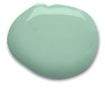
  California Paints recently came out with A Guide to Color, Styles and Architectural Periods - a great brochure that's part of their Historic New England paint collection. Here are the styles and paints that they surveyed for U.S. homes. Click on each period name to see California Paint's color collections, historically accurate recreations of how our homes were once painted (both exterior and interior colors are shown - usually the bolder colors are how the interiors were decorated, versus the more subtle exterior hues).
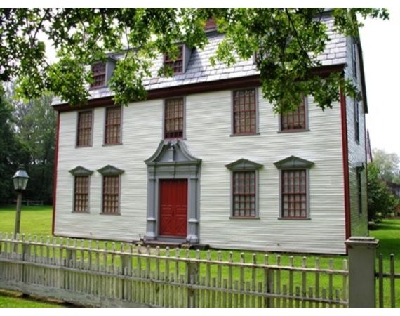
- Colonial - Mid 1600s-1780: European settlers set these style precedents as they brought over what they were familiar with back home. A limited number of colors were available at the time, mostly made from naturally-derived pigments (earth, stone, etc.). Framing and trim elements were painted in colors that boldly contrasted with surrounding or untreated or neutral wood and masonry walls. 18th century homes show Georgian England classicism and are mostly found on the East coast, while colonial architecture in the Southwest shows off their Spanish Baroque roots. These homes usually had white trim and strong contrasting colors. Bold and bright.
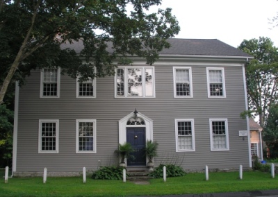
- Federal - 1780-1830: Georgian boldness gave way to more delicate house detailing, and "federal" got its name from the new American republic. Interest in Greek and Roman antiquities was high at this time as Americans were fascinated with newly-excavated classical sites. Colors were lighter, paler, and delicate with whites, pale shades of gray, off-white, and ochre used on exteriors.
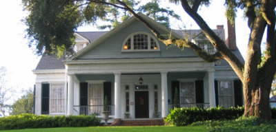
- Greek Revival - 1825-1855: This was America's first "national architecture." A growing population fueled a big home building boom, and this style was carried across the country, spreading out from Eastern seaboard cities. Greek temple inspired, there are classic columns and pediments even on the most simple of homes, with exteriors painted white, off-white, ochre, and gray along with white trim. Shutters and window sashes were primarily painted dark green or black.
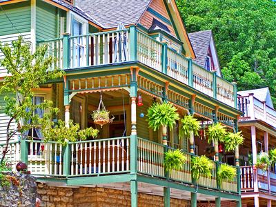
- Victorian - 1840-1900: England's Queen Victoria's long reign saw many residential home styles embraced under the Victorian umbrella, including Romantic Gothic, Italianate, Egyptian Revivals, Second Empire and Stick styles, Queen Anne and Shingle styles, and Colonial Revival. Middle class suburbs were springing up in the United States, and industrialization was hitting the building industry with mass-produced millwork and trim. Exterior house paint saw a growing range of hues with the diversity of architectural styles. Using a 3-paint color scheme became the norm; one color for the siding, the second for the trim, and the third for sashes, shutters, and doors. Even the body colors could vary to differentiate shingles from clapboards (some homes had four or five colors - see the "painted lady" style in the top photo).
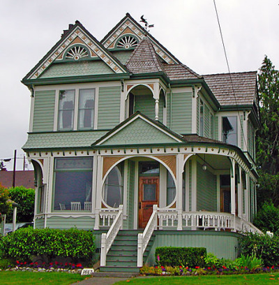
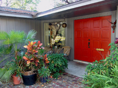
- 20th Century Eclecticism - 1900-1955: Here's the period where our architectural styles forged ahead into two entirely different directions. One saw copying of historical architectural styles, and the other moved away from everything traditional that had come before. That's what's given birth to today's "traditional versus modern" style divide! The traditional movement saw "revivals" of older styles from the past, with "modern" or "contemporary" homes going into brand new directions like Craftsman, Four Square, and Ranch. Exterior surfaces used stuccos, brick, stone, and concrete in addition to wood siding and trim. The Tudor and Craftsman houses were usually painted dark browns, maroons, deep greens, and olives. Classic revival homes are usually lighter white, gray, gray-blue, gray-green, or yellow with white trim and window sashes and dark shutters and doors. Modern homes throw out the color book, but usually tend towards light neutral colors with bold, sometimes primary color accents.
Bonus
Click here to read Design2Share's advice on What Determines a Good Paint Job.
![]() Click here to subscribe to our daily design videos and features.
Click here to subscribe to our daily design videos and features.


